 Worth a Thousand Words
by shinkoryu14
--------
When one thinks of the Neopian Times, it is usually the authors and their stories that come to mind first and foremost. This is as it should be, for the Times is a fabulous tilling ground for creative stories and colorful characters to take root. But there is one aspect of the Times that is oft overlooked and underappreciated, an element to the paper that has been with it since its inception. And in honor of Issue 650, I would like to at last bring this integral component into the limelight.I am speaking, of course, of the Neopian Times preview images. We all see them in every issue; those little pictures that are meant to grab your eyes and make you curious enough to click over to the story. Most of the time these are customization images, shopkeepers, TCG images, or neopedia images. But, if you are very lucky, you might just get an image drawn by one of TNT's artists just for your story. Almost every week at least one or two stories will get one of these custom images, and having one goes a long way towards making your story stand out from all the others. While nothing is more exciting than checking the Times on Friday and finding that your story has been given a unique preview image, there really is no easy means to thank these kind artists, nor are they given nearly the amount of recognition they deserve for their efforts. Therefore, I invite all of you loyal readers to join me in showing our appreciation for the Neopian Times preview artists by counting down the top twenty best Neopian Times preview images! In order to most completely represent the Neopian Times- all 650 issues of it- I have taken special care to ensure that this list includes at least one image from every hundred issues of the Times. With over 4000 images and counting to chose from, you can bet it was hard to narrow it down! So without further ado, I present the top twenty Neopian Times custom preview images! Number Twenty
Pulled from deep within the archives of the Old Neopian Times, this image made its debut in issue 66 with the series Time Twisters by Too_Kule. Though in those early days the Neopian Times did not have the same resources that it commands now, browsing through the previews makes it obvious that there was still a great deal of love and dedication to be found among the artists. This cute, simple image of a faerie Zafara wearing what appears to be a magic ring is enough to draw the eye and make a person curious about the contents of the story. The artwork may be old, but it is still everything a Neopian Times preview needs to be, and it firmly earns the number twenty spot on our countdown.
Number Nineteen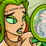
This hilariously eyebrow raising image first appeared in issue 179 alongside the story A Rather Unsuccessful Attempt at an April Fool's Joke by Shadowcristal. An interesting point to note is that stories which center around a canon character- like Illusen- are remarkably easy to find existing art for. There is no reason why the Times can't just publish these stories with something that already exists in order to save time. This makes it all the sweeter when an artist does produce a completely unique picture for such a story. Just looking at that image immediately piques the reader's interest. Who is trying to auction Illusen for 1 NP? Why? How in blazes did they manage to bring this scenario to fruition? All questions that immediately pop to mind just from looking at the picture, and present an irresistible lure for the story within. Number Eighteen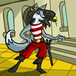
Making its first appearance in issue 239 with the series Chronicles of the Court Rouge: Treachery by Nimras23, this image is interesting in that it showcases the Neopian Times artists taking into account in-story descriptions when drawing the previews. It would be much simpler to draw a default pirate Lupe in its default clothing. But the artists behind this preview gave the Lupe a unique outfit, the long black hair she's described with in the story, and an expression that is very indicative of the sort of character she is. Though the picture's relatively simple composition means it only places eighteen on our countdown, the attention to detail and level of character design customization still firmly earns it a place in the top twenty Neopian Times images of all time.
Number Seventeen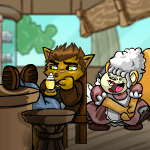
This image appeared for the first time in the short story The Best of Friends by Cosmicfire918 in issue 623. Anyone who participated in the Spooky Food Eating Contest will immediately grin upon seeing this preview, recognizing this scenario from a comedic throwaway line in the event. Even those who haven't will very likely still recognize the Crumpetmonger lady, and be intrigued by this maligned looking Wocky-man to whom she is giving her overly enthusiastic attentions. And really, who wouldn't want to read about a Neopian shopkeeper slathering unwanted affection on an overworked, overcaffeinated monster hunter?
Number Sixteen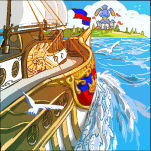
This preview debuted with the story A Roo-yal Expedition by Maltese51191 in issue 413. I'm going to go ahead and say what we're all thinking- it's pretty. It's really, really pretty. Like, whoa, look at the detail on that ship! One has to imagine that in the case of these previews, which are very small and have to be converted into the memory-saving .gif format, that the artists would keep the drawings relatively simple. But boy oh boy would you be wrong, as this and others further on in our countdown will show! It takes a subtle, skilled hand to make an illustration interesting without a single visible character, but this preview does it perfectly!
Number Fifteen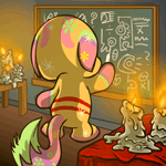
Taken from the short story See You Later by O_Liveandlearn_O in issue 357, this is another example of artistic talent applied in a subtle, but impressive way. Under most circumstances, disco painted pets are hard to make anything but bright and loud. The vibrant colors clash with most settings, and while this isn't necessarily a bad thing, it does make them stand out a bit more than artists usually prefer the characters to do against a backdrop. But in this preview the artists uses the subtle application of firelight from the candles mentioned in the story to set a soft orange hue over the entire scene. This allows the orange of the Kacheek to appear more naturally a part of the scenery, and gives the entire preview a very nice, well balanced color scheme.
Number Fourteen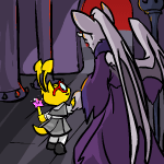
This image comes to us from the series Curses, Inside-Out by the collaborative team of Schefflera and Dreagoddess in issue 197. Like the picture with Kell and the Crumpetmonger lady, this image is interesting and eye catching because of the presence of two canon characters having an unexpected interaction. But in this case it isn't anything that was hinted at in the plots these characters came from- it is an entirely baffling image of Lisha walking hand in hand with Lord Darigan, two representatives of nations that traditionally have a tense truce at the very best of times. I have to admit that with this one I sort of cheated and let bias drive the choice- Curses, Inside-Out was the very first story I personally ever read in the Neopian Times, thanks in large part to the draw of this preview image. Getting to see two sworn enemies walking together as allies, and perhaps even as friends, was far too tempting to resist. Number Thirteen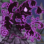
This image debuted with the series Out of the Shadows by Rachelindea in issue 539. I have described pictures on this list as funny, cute, and pretty, but this one... this one is cool. No holds barred, the way the wraith Ogrin was drawn in this image is awesome. The ribbons of energy snaking off of it give the Ogrin's body a sort of ethereal look, as if at any moment his form could shift into something else. The lack of shading or outlines makes him stand out starkly against the background, as if he is not entirely of the world he's set against and doesn't belong there. It's definitely an image that promises and intriguing story full of dark magic.
Number Twelve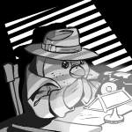
This image made its first appearance in issue 370 with the short story From the Files of Phil M. Nwar by Goosher. Now the first and most obvious thing that jumps out at the view about this preview is that it is in black and white- something very unusual for the Neopian Times. But this really lends itself to the tone of the story, a classic film noir mystery. And just because the image is black and white, that doesn't mean it can't have depth or show off the talent of the artist. The heavy black shading creates a lot of sharp contrast, while the more subtle grey shading from what appears to be light filtering through window blinds gives us a sense of the layout of the space. And though the style is simple and minimalistic, the artist still manages to include fun details like the Bruce's five o'clock shadow. It's a great picture that perfectly complements the story! Though one has to wonder where Phil got that rotary phone when poor old Nigel has to make do with a plastic cu- *gagged and dragged away by meepits*
Number Eleven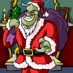
This image debuted in issue 170 in the short story Dr. Sloth's Big, Bad Christmas Heist by Shadih_Temporary. And I have no words for it. Santa Sloth speaks for itself. Number Ten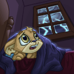
Taken from the story Nightmares by Melina322 in issue 631, this picture has a bit of a different coloring and shading style than we usually see in the Neopian Times. When it does show up, however, this art style is invariably very good, utilizing unusual settings and light sources to create a subtle color shift from areas of light to areas of shadow. In addition to the beautiful coloring, the expression on the baby Kougra's expression and posture are perfect to reflect the mood of the image. The perspective- looking up from beside the bed- makes the storm look very menacing as it looms over the viewer, helping to amplify the terror that it inspires in the Kougra. All in all a very well done drawing, and the perfect candidate to break us into our top ten!
Number Nine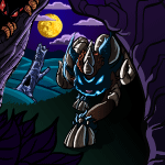
The preview in ninth place comes to us from the series Out of the Shadows by Yami_no_prodigy in issue 499. Yes, the story has the same title as the one from the thirteenth place preview, but I can assure you they are different stories by different people! But we're here to talk about the picture, not the story- and the picture is really pretty! Slightly creepy, as mutants often are, but creepy in a way you can't help enjoying. The unknown beastie that is coming out of the tree in the corner creates an air of mystery and danger for the mutant Acara, but is the that Acara the story's hero or it's villain? There is enough ambiguity to leave the viewer curious, and the picture is stunningly beautiful besides! Well worth the number nine spot on the countdown!
Number Eight
In this picture from the short story The Inventory by Rosiecotton from issue 630, we see another example of that beautiful, subtle shading style. But more than that, we see an artist having way too much fun visualizing the writer's interpretation of an inventory bag! Nothing catches the attention better then seeing something unusual and interesting, a concept that we haven't seen before. The execution of this image is fantastic, the bright colors almost seem to glow against the white background, and the little cubes stretching off into the distance give the space a sense of endless vastness. I can't imagine a better image for this idea! Number Seven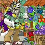
This picture debuted in the series King of the Land of the Sun by Saphira_27 in issue 591. And like... whoa. If there was a whole lot of detail in the number sixteen picture, it pales in comparison to the amount of detail the artist of this picture managed to cram in. There are at least thirty individual flowers on the shopkeeper's stall! All of the bright, vibrant color really jumps out and grabs the viewer's attention. It's also fun to see King Altador in less formal clothing- you have to imagine that armor gets pretty stuffy after a while!
Number Six
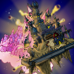
I like to imagine that there is a psychopathic manchild in every one of us- yes, even girls like myself- who just cannot say no to big epic explosions. Making its debut in issue 547 with the series The Game of Master Hog by D_Morton, this preview image takes full advantage of that. Ingenious in its simplicity, the preview shows us a scene that is both terrifying and thrilling- two floating cities plowing into each other. And the only way to find out how such a scenario came to pass is to read the story! Number Five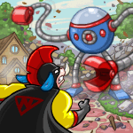
This preview comes from the series Chronicles of a Caped Crusader: Against All Odds by Kristykimmy. And as with the last image, the premise of this picture is enough to make that manchild in all of us shriek with glee. Giant robots! Super heroes! Wanton property destruction! And looking past the concept at the actual art, there's some unusual but actually rather clever stylistic choices. Most of the background, including the robot, has colored lineart. Judge Hog, however, has solid black lineart. This makes him stand out very starkly against the rest of the picture, and combined with the robot's left pincer pointing in his direction, makes him the focal point of the image. All in all it is a really awesome picture, and I couldn't pick a better one to start us in on the final five! Number Four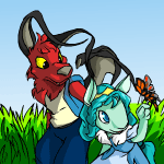
It's a bit odd isn't it? After all the explosions and giant robots, the fourth place picture is actually a very simple, tranquil one. This image comes from the short story Chasing Clouds by Phsycoticdancer in issue 301. The contrast between the innocent young royal Kyrii and the somewhat menacing figure of the Darigan Gelert piques the viewer's curiosity. It's clear from the postures and expressions of both characters that there is no animosity between them- in fact the Gelert looks somewhat confused and curious, as if unsure what to make of his small companion. The image is very cute overall, and one of my personal favorites.
Number Three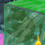
This preview made its debut in issue 310 with the series What Am I? by Sarahleeadvent. While seeing creatures floating in vats of nameless glowing fluid is hardly a new concept, it is still one that we can't help being intrigued by. Who is the shadow Zafara in the tank? Why is it in there? The glass and water effects on the tank are also nicely done, and though it would have been easy to make the back of the tank opaque with no one noticing, the artist took the time to detail the walls and piping visible through the glass. Though it like the previous image is fairly simple compared to some of the others on our countdown, it serves the story well and provides an excellent example of TNT's custom Neopian Times art. Number Two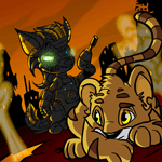
Getting down to the wire, folks! Our number two contender was originally published with the series Sunlight Sonata by Kittengriffin in issue 359. This preview is definitely a fantastic piece of artwork. The dramatic lighting, which casts the front of the Kyrii almost entirely in shadow, makes the entire scene very intense and not a little frightening. And yet despite the deep shadows, we again see that TNT propensity towards adding an insane amount of detail to the artwork. Close inspection will reveal that every seam on the robot's body has been drawn in, and the lack of casing on the head makes it even more complicated. And like any good Neopian Times preview, it isn't just pretty- it makes the viewer want to read the story. A potential reader can't help but be legitimately concerned about the Kougra- why is this Kyrii menacing him? What's going to happen to him? Why does the backdrop look post-apocalyptic? All of these factors make it impossible not to rank the preview for Sunlight Sonata very high on the list- but there is one Neopian Times preview that's still even better. Without further ado, I present...
Number One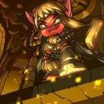
The illustration for the series Infinity II: Control by Blueys45, which first appeared in issue 577. There is nothing about this preview that is not absolutely perfect. The lighting is superb, the color and shading are fantastic, and the exquisite attention to detail on the character's costume and the background just bring everything together into an expertly crafted work of art. The pose and expression of the character are delightfully smug, making her seem at once despicable and impossible not to like. The angle helps this impression, positioning the viewer so that they are looking up at the Acara from below the ledge, making it appear that she is gazing down on the audience and laughing at them. Even tiny elements like the embers flickering upwards and the swishing of the character's hair in the backwash of heat from below are integral to making the entire piece just plain perfect. This preview earns a very well deserved spot as the number one Neopian Times preview image!
I hope that you all have enjoyed this little sendup to the artists of the Times. They work hard and tirelessly, making unique and thoughtful works of art to perfectly compliment the stories written by the users of Neopets. To everyone who has, does, and will contribute preview art to the Neopian Times- thank you.
Happy Issue 650, everyone!
|