 The Symbolism Of The AC Team Logos
by aleu1986
--------
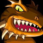
We all have our favourite Neopian land, and as such a team that participates in the annual Altador Cup. Many support their chosen team year after year, but have you ever wondered why your teams logo looks the way it does? In this article we will be exploring the appearance of the Altador Cup team logos, their symbolism and how they represent their land. Altador 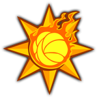 While two other team logos also proudly display a Yooyuball, it makes the most sense for the Altador logo to show off this famous petpet, the very basis of the beloved sport. The Altador logo is quite dramatic, with the large spiky sun shape and a fire Yooyu in front of it. The sun is a central symbol in Altador, with one of its guardians and founders being Siyana the Light Faerie. The climate is also warm and sunny, thanks to the aforementioned faerie working together with Psellia the Air Faerie. Yellow and orange, the sun`s colours are used as the signature colours for Altador. Yooyus are native to this land, and besides being used in the sport of Yooyuball, these petpets are trusted messengers for King Altador himself. The flames in the logo is another reference to the sun and its fiery energy.
Brightvale 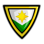 This team`s logo is quite simple, it represents the Brightvale flag with a yellow border added around it. The white colour represents peace, harmony and honesty, and the green stands for hope and prosperity. The bright yellow star is a symbol of light and knowledge. The land itself is lush and green, and known for a variety of locally grown fruits. The country of Brightvale is famous for valuing knowledge and is known for its scholars and poets. Even the ruling king has the name King Hagan the Wise. This land is peaceful and also amongst the most prosperous in Neopia.
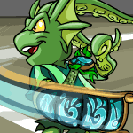
Darigan Citadel 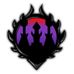 The towers of the Citadel appear in the middle of this dark logo, and the gloomy purple and red colours represent the dark, cloudy skies that constantly hover above the barren land. The small town around the Citadel is closed in by a tall wall with spikes on the top, represented here by the thick spiky lines framing the logo. The Darigan Citadel team logo is a very literal representation of the land. Faerieland 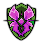 Previously, the colours on this team`s logo were brighter and consisted of pink and purple. After the Fall of Faerieland this was changed, and now the wings are a darker shade of purple and the shield has turned green. The base for the logo is a green shield, which represents Aethia, the Battle Faerie. The purple wings are a tribute to faerie folk in general, but particularly to Fyora the Faerie Queen. The gem in the middle is the Battle Faerie`s amulet. The Faerieland team logo represents both strength and courage, but also beauty and magic. Haunted Woods 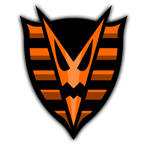 Simple, yet effective, the Haunted Woods team logo sport their signature colours of orange and black and a spooky V-shaped Jack-O-Lantern face in the middle. The orange colour and the stripes represent the pumpkin lantern, the very symbol of Halloween. The lines also pay tribute to the Deserted Fairground, with its stripy carnival tents. The black colour represents darkness, night and death. Kiko Lake 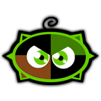 One of three Altador Cup team logos to feature a Neopet of some kind, the Kiko Lake logo is made up of a round shape and a pair of angry eyes. It`s essentially a Kiko without arms, but with a tuft of hair and the four spikes in the background representing the Kikos four fingers/claws. The green colour hints at the forest growing around the lake, whereas the brown represents the carpentry and woodwork this small community is so known for. These colours also represent borovan, which is a mixture of hot chocolate and asparagus. Within the forest around Kiko Lake, there is a field of asparagus with a river of hot chocolate running by, thus providing the inhabitants of the lake with fresh borovan all year. Krawk Island 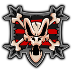 This team logo bears the iconic skull and bones seen flying from the mast of any pirate ship. The skull is naturally that of a Krawk, and it sits upon a tattered pirate shirt. The red colour represents power and is also seen as a warning of danger. The black colour represents determination and the defeat of enemies. Krawk Island bears this name due to the mysterious Fungus Cave, where you can bring your Krawk petpet and have it eat some of the fungus that grows inside. It will then grow into a Krawk Neopet. Kreludor 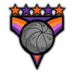 The Yooyu-shape in the middle is made of moon rock, combining the elements of the sport Yooyuball and the planet or Kreludor. The purple and orange colour scheme represent the two tribes of Grundos, one orange and one purple, who after some fighting and disagreements today live together in peace and harmony. The stars hint at the connection to space, where Kreludor is located. The Lost Desert 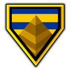 The colour scheme of blue and gold represents several different things. The blue shade stands for royalty and water – a very precious resource in the desert. Gold represents literal gold treasure and wealth, but also the sun. The yellow shade can also hint at the desert sands. The same blue and gold colour scheme can be seen on the headdress of the late King Coltzan. The pyramid represents the early days of the civilization in the Lost Desert, when it was populated by a race of intelligent Gebs, ruled by Sutek. They built the pyramids (also known as Gebmids) that still stand in the desert to this day. Maraqua  The shape of this teams logo is similar to a shield, hinting at war and defence and refers to the Curse of Maraqua, when this land was invaded by pirates. The seaweed and bubbles refer to the ocean and the fact that the city of Maraqua is located underwater. The base of the logo is made of maractite, a shiny and incredibly hard metal only produced in Maraqua. It`s adorned with an ancient rune which also appears on the Oversized Maractite Rune Sword. The meaning of this symbol is unknown, however. Meridell 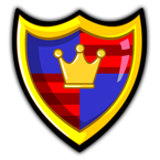 The team logo is similar to the Meridell flag. The crown represents the monarchy (King Skarl) and the added border around the logo gives it the appearance of a shield, a hint to the wars fought in the past. The red colour represents strength and bravery while the blue stands for liberation, good fortune and justice. Moltara 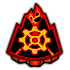 The symbol for this lands team is quite straightforward, a volcano with a massive gear in front of it. An active volcano sits at the heart of an island west of Altador, which provides the main entrance to this land. The city and caves of Moltara are located near the planet`s core, and a tribe of Moltarians have learned to control the magma. The gear represents the Moltaran steam-powered technology. Mystery Island 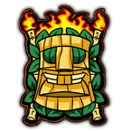 The logo for this team has several different elements to it. The tiki mask represents the Tiki Tack Man who runs the Tiki Tack shop (also known as the Tombola Man) and the green leaves represent the palm trees around the Mystery Island beach, as well as the jungle. Torches are used across the island to provide light after sunset and are also used as part of celebrations and rituals. The flames in the background represent the volcano on Techo Mountain. Roo Island 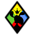 The black silhouette of a Blumaroo with the crown floating above its head represents the islands native species and the monarchy (King Roo). The fact that the Blumaroo in the logo is not wearing the crown, means that it`s not the King himself who is pictured. The Neopets mouth is open and smiling, referring to the happy attitude of the population of Roo Island. The shape of the logo is that of a diamond (like in a deck of cards) referring to the Roo Islanders love of games and gambling. This theme is continued with the colours yellow, blue red and green, representing the game of Dice-A-Roo where dice of these colours (plus a white one) are used. Shenkuu 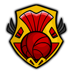 In Shenkuuvian culture, yellow is considered a colour of good luck, and also connected to power, royalty and prosperity. Red is connected to good fortune and joy. The Shenkuuvian flag sports these colours, and it`s worn and used by all to celebrate the new year for the Lunar Festival. The team logo proudly sports a red Yooyuball, and the stripy design refer to the sails of the Cyodrakes Gaze, the famous airship that has its home port in Shenkuu. Terror Mountain 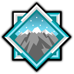 Similarly to the Darigan Citadel logo, this team has a fairly literal and direct representation in their teams symbol. The mountain shown has three peaks, representing Happy Valley, the Ice Caves and the Mountain Top – the three levels of the mighty Terror Mountain. Snow falls over the three peaks, representing the blizzards and harsh climate. The sharp, angled shapes refer to snowflakes and ice crystals and the team`s signature colours of white and light blue underline the connection to snow and cold weather. Tyrannia 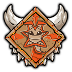 The logo for this prehistoric country is made of stone and clay which is cracked and shows signs of age. The materials are simple and natural, hinting at the primitive conditions. In the middle sits an Orange Yooyu with a neutral expression. The orange colour represents courage, but also fire and sunlight. The horns are a representation of strength, power and brute force. The teeth refer to the Lair of the Beast, a cave on the Tyrannian Plateu. Around the opening is a rock formation that looks similar to an open mouth with sharp, jagged teeth. Virtupets  The red V stands for Virtupets Space Station. This teams signature colours are silver and red. The shade of silver represents metal, hardware and technology, shown also by the metal plate serving as the base for the logo. The red colour stands for power and dominance. The Space Station was created by Dr. Sloth, and was for years under his control. He had built it as a part of a plan to turn Neopets into mutants using a transmogrification ray which was built into the station. Dr. Sloth was defeated by the Space Faerie, and his later attempt at seizing control over the Virtupets Space Station was foiled by the Resistance. I hope you enjoyed this article and learned something new about your favourite team! Please Neomail me with any comments, I would love to hear from you. Thank you for reading, and best of luck to your team in this year's Altador Cup!
|