 Judging the Best and the Worst Game Trophy Designs
by xiaolin10413
--------
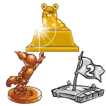
Neopets has been around for almost 16 years, and with it has come many games for Neopians to enjoy. With a lot of practice and sometimes a little luck, it is possible to earn trophies for being exceptionally good at these games! Not all trophies were made equal however. Some are quite beautiful, in both design and representation, while others don't quite meet the mark, or a plain eyesore for the typical to even want to glance. After carefully judged all the available trophies, and a few cups of tea, a team of experts have come up with a list of trophies that will add… visual spark to your User Lookup. Each trophy was given a design score and a representation score. Design was scored by seeing how the trophy simply looks, or how atheistically pleasing to the eye it is. Representation is scored by how much it represents the game, such as different elements of the game. The Five Worst Looking Trophies: 5. Snot Splatter Plan to get a little… messy for this trophy. Help thwart Meuka's plans by getting rid of his malicious snot-webs. Add drops of mucus to blast away his traps and land yourself a high score. Design Score: 4 Representation Score: 6 Hope you brought some heavy-duty gloves to carry this trophy home! The design itself is just plain gross. The gold trophy appears to be dripping with snot, and to top it off, looks like it's filled with it too! The silver trophy looks like a more melted version of the gold, and the bronze looks like a giant booger. The trophy design for this game could have been done just a tad more tastefully. You can be thankful these trophies are not actually made out of snot. The trophy does indeed represent the game. It is called Snot Splatter, and you do get a snotty trophy. The trophy misses a few points for not including other aspects of the game, like the web-grid or Meuka himself. 4. Nimmos Pond In this game you are a Nimmo, sitting on a lily pad, trying to destroy other lily pads. Destroy enough of these multiplying lily pads, and make sure you don't get knocked into the pond, and you just might earn yourself a trophy.
Design Score: 5 Representation Score: 5 The design itself is alright, it does have a recognizable Nimmo on it. But, compare an actual Nimmo to the one depicted on the trophy and you will easily see all the anatomical error that doesn't physically match. Of course, the etchings of the place number on the base are tacky, especially when between the gold, silver, and bronze trophies, they aren't all in the same spot. The representation of the trophy does its job, but not well. A Nimmo standing on a base cheering? The base isn't even a cool lily pad, which is a main part of this game! Another point worth mentioning, in the game it is representing, the Nimmo never stands like that on two legs. A Nimmo sitting on a lily pad covered in gold, silver, or bronze would have sufficed. He even could have been holding his thumbs up too, if that's what was truly desired. 3. Punchbag Bob Does your pet have some pent up frustration, but isn't strong enough to take on a real opponent? Then fighting Punchbag Bob might the guy to battle. He won't fight back, so even the weakest pets can beat him, and then this… "lovely" trophy will be yours! Design Score: 3 Representation Score: 10 The design itself is not creative, but in turn the representation is great. The trophy is a replica of the punchbag that was beaten, therefore a low design score. No offence to Punchbag Bob, this isn't exactly the most beautiful punchbag in the world anyone would want to feast their eyes on. 2. Barf Boat A strong stomach and a pair of sea legs are needed for this game. Your goal is to balance the ship on the stormy seas while trying to keep the petpets on ship and not throw them overboard, while your Warf Captain throwing up all over the boat. Send your last petpet into the drink and you'll be greeted with a screen of barf. Design Score: 5 Representation Score: 6 The designer of this trophy wasn't too creative with the idea, and also didn't try to make this trophy any less disgusting than the game itself. A barrel full of barf? Ick. It did earn some design points for the barrel looking like a barrel, and the barf being green. Not many trophies have extra colors besides the gold, silver, and bronze. Representation does a little bit better than design. The trophy does include barf, just like the title of the game. The score could have been higher if the other part of the title had been included: a boat. Or perhaps even a petpet? Nonetheless, this trophy does it's job representing Barf Boat, no matter how gross it is. 1.Grumpy Old King Have what it takes to make the Grumpy King laugh? Well, input your joke and give it a shot! Usually he will be unamused, but if you get him laughing hard enough, you get to take home a trophy of… The Grumpy King laughing. Design Score: 4 Representation: 8 Like some of the other trophies on this list, design is low for uncreatively and the subject matter being less-than-beautiful. True, there is not much content for a game that is just telling a joke to a king, but at least make the king look a little nicer! I'm sure he would've appreciated it anyway… Representation does a pretty decent job, however. King Skarl is depicted, and he is laughing, which is the primary objective if you are aiming for the trophy. Not much else to say, as there really isn't much else that could best represent King Skarl. And that concludes the "ugly trophies" list. Of course, it's always good to have some balance, so we would now introduce to you the more aesthetically pleasing trophies to add to your collection!!! The Five Best Looking Trophies: 5. Maths Nightmare You might want to have a calculator for this game! Help a poor Aisha get some sleep before her big test by solving math problems before she wakes up! Be quick and clever, and maybe a little lucky, and you just might find this beautiful trophy on your User Lookup! Design Score: 8 Representation Score: 8 The artistry of this trophy is great, and the use of the components from the game deserve extra brownie points, and representation score is also high. It contains three main components of the game, the main character Imiya, a book to represent the math, and the cloud to represent the nightmare. The only things that remain missing are the cute little Babaas. However, the current stacking of the components is just enough, and more might make it look too busy. All of that combined with the fact it's just nicely done earns its high score. 4. Escape from Meridell Castle Get ready for a long and grueling escape. Your goal is to help a blue Draik Valrigard escape from the dark depths of the Meridell Castle dungeon. You'll be faced with guards, lava, and fatigue. If you can successfully escape (and collect enough gold stars) this awesome trophy will be yours. Design Score: 6 Representation Score: 7 This trophy is pretty awesome looking, but it's not the greatest either. The design itself is pretty cool though with Valrigard grasping his sword in a Warrior pose. However, the lines of the trophy aren't as clean as they could have been. Also, the trophy is the exact same as the image that appears when you click "play game" which is slightly disappointing. Representation is pretty good. Too much more added in and it probably would've been a little too busy. The main character plus his weapon in a cool pose pretty much does the trick. 3. Assignment 53 A transmission is coming in… the Alien Aisha Invasion Force needs your help! Save enough Aishas from several dangerous planets in this old-school platform game, and you can get a pixelated trophy for your User Lookup. Design Score: 9 Representation Score: 7 The design of this trophy is just awesome. Although it's not clean in the traditional sense, it's really amazing how it follows the style of the game and is 8-bit. The star was the perfect image to use for it, since it is a simple image that wouldn't look too confusing with the 8-bit style, like an Aisha would have. Representation isn't as high, because it is just a star, which isn't a huge part of this game. The design itself does a good job at representing Assignment 53. 2. Shenkuu Warrior II Ready to scale some mountains? If so, control Princess Terrana to help her with the moment she has been training for! The more mountains you climb, the higher your score will climb as well, and might just earn you a trophy! Design Score: 9 Representation Score: 9 This trophy scores great in both design and representation. The craftsmanship is wonderful, the different components clearly seen and not all muddled together. The only thing that could've improved the design more was adding a part of rope to the grapple hook, to make it look more like a grappling hook. This trophy has the mountain, the hook, and the flag of Princess Terrana, good representation for all parts of the game. Again, a rope with the grappling hook really would've taken this trophy to the next level. 1.NeoQuest II This is a long, difficult game, where you control Rohane and his companions in an epic journey. Like it's NeoQuest I counterpart, the game requires patience, hard work, and focus, but if you can beat it, you are guaranteed a shiny new trophy. Design Score: 9 Representation Score: 8 The trophy depicts Rohane, the main character of the game, in a fighting stance, holding his sword. The details in this trophy are pretty astounding, and it still looks clean. The only thing that stops this trophy from a perfect design score is the slightly worried look on his face. Rohane is the hero of our story, and he should not look concerned! This trophy represents the game fairly well. It includes Rohane with his sword, posed for battle. However, there is much more to this trophy than just that. Despite this, the trophy does a good job including what it could without making the trophy look too cluttered.
That concludes the offical list, but, of course, the NT trophy had to be included!
Design Score: 10 Representation Score: 10 Of course, this golden quill scores perfect marks in both categories. The trophy is simple but beautiful, even including a little trail of gold ink behind it.The quill (and the Weewoo) is a long-standing symbol of the Neopian Times. Overall, a perfect trophy for what it represents.
|