 How to Brighten Your Illusen-esque Customs
by swordlilly
--------
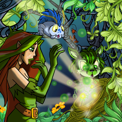
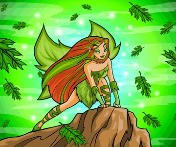
What are Illusen's favourite colours? The answer seems simple: green and brown. Illusen is an Earth Faerie, after all. When you look at the items made in her name, you'll see that they all come in these earthy tones:      And yet, when I tried to make a spring customisation based on these colours, something felt off:  While it did look cohesive overall, the picture seemed flat somehow, and I couldn't figure out why. It took a series of small epiphanies to arrive at the answer: in order to bring out Illusen's greens and browns, I needed to add just a touch of red and blue. The first epiphany came to me when I was playing with some NC items from the recent Neopies event. The Gold Trimmed Roses Foreground and VIP Raffle Patio Party Background worked really well together, even though they contained different colours:  On my own, I wouldn't have thought to put red roses in front of a background that is mostly green and gold, with a hint of blue. Yet the colours supported one another perfectly. Why was that? Why did they not clash? I did a little bit of reading, and learned that red and green were complementary colours. They were opposites; placed side by side, they made each other more vivid. The blue and gold in the Neopies background were also complementary colours. (I'd learned about complementary colours before actually, in art class when I was a child, but over the years as I got busy with school and work and fell out of the habit of making art, this knowledge slipped to the back of my mind.) In painting, there are three primary colours from which all other colours can be mixed: magenta, cyan, and yellow (commonly simplified as red, blue, and yellow). When you mix blue and yellow pigment, you get ranges of green. And when you mix all three colours together, you get brown. The more red in the mix, the earthier the brown; and the more yellow, the more gold. Colours complement each other when they are comprised of different primaries. For example, if you have an orangey-brown (mixed from red and yellow pigment), its complementary colour would be blue. Illusen's colours, on their own, don't pop. It takes a bit of red to set off her green, and a bit of blue to set off her brown. Think of bright flowers in a green forest, and blue water beyond the rock. With this knowledge came the second epiphany: when I looked at pictures of Illusen, I noticed how they included splashes of primary colours for emphasis. In this image from Caption Contest 1111, for example, the blue Boween in the middle helps bring out the reddish-brown in Illusen's hair:  The inky, purplish-blue branches in the background also contrast with the yellow-white light in the foreground. Green and brown are still dominant throughout, but the subtle dashes of primary colours make the whole picture vibrant and rhythmic. Here's another picture of Illusen from an old trading card game:  The light blue shimmer around Illusen makes her pop against the brown rock, and her reddish hair looks vivid against the forest's green. Without the blue, she would recede into the background; and without the red tones in her hair, she would blend too much with the rock. I now understood how to liven up some customs I had been working on. Below are two versions of my Pteri's spring custom, before and after my epiphany:   You can see that both versions are filled with forest hues, but the second version pops more because I swapped the green shirt (Striped Dueling Shirt) for a red one (Dyeworks Red: Pirate Knots Shirt), and the brown trousers (Flying Pteri Trousers) for a deep blue pair (Swashbuckler Trousers). I made some other subtle changes as well. Whereas previously the shiny bracelet dragged the gaze sideways, I removed it and added a Sun Shower instead, pulling the gaze back towards the centre. Finally, to return to my Kacheek's Illusen-esque custom with which I'd begun this article, I ended up reworking it quite significantly. In the first version, the greens and browns blended too perfectly together. The brown of the hair was the same as the brown of the tree branches and soil. The dress matched the grass and shrubbery too exactly. To increase the contrast, I chose redder hair against a sandier background, and a deeper green dress against lighter green plants. I also added more difference in the lighting overall: Dyeworks Yellow: Scattered Light Shower to brighten the upper area, and Premium Collectible: Succulent Garden Foreground to darken the lower-left side. But there was still something missing:   The final changes I made were subtle: I swapped the neutral-toned glasses (Black Square Glasses) for a bright red pair (Cute Kougra Eye Glasses), and the green jacket (Forest Green Peacoat) for one with a bluer tone (Quilted Jacket). And just like that, my Kacheek popped more. When I first started customising, I liked to simplify colours because I felt that doing so gave my customs a touch of artistic deliberateness. Too many colours in one place felt messy. The mistake I made was that in wanting to simplify the mess, I went too far. In the first version of my Kacheek's custom, I chose earthy tones and only earthy tones. That's why the entire custom felt so flat. It was like a muddy, grassy landscape without any flowers or sky. Of course, in reintroducing primary colours it is possible to err too far in the other direction as well. If I were to add a red dress and blue shoes, for example, the unity of the green-gold custom would start to fall apart. Choosing the right balance of sameness and difference is always a challenge, and I am always learning. That's part of what makes customising so frustrating - and so fun.
|